


Looking at the world around us, from foggy geopolitics to gyrating financial headlines, one can’t help but think, as the Jedi knights would say, that there seems to be “a disturbance in the force.”
Disturbances…
We are all familiar with the front pages and their “disturbances.” We’ve seen conflicts from Kyiv to Gaza to the Strait of Hormuz.
In Europe we see mass protests in London, polarizing election swings and an EU paralyzed under the massive weight of rising costs, widening social tensions and an ineffective Brussels bureaucracy.
Meanwhile, in the USA, as political divides deepen in a nation saddled by climbing inflation, declining trust and a ripping stock market, the disconnect between Wall Street and the worst consumer sentiment readings in over 50 years almost boggles the mind.
In short, things feel pretty… well, “weird” out there.
From Opinions to Facts
In such distorted backdrops, we all have opinions, biases, and frustrations, none of which myself or anyone else can solve with any magical words or unanimous consent here.
But moving from politics to economics, there are certain signals which stand above bias or opinion.
Facts, after all, are stubborn things. They help us see beyond the sirens of ChatGPT wisdom, dystopian AI-dependence or political soapboxes.
Instead, facts bring us back to the honesty of math and the whispers of historical precedent, and hence historical lessons, which in turn can offer historical guidance.
But facts, like the truth itself, are easy to ignore. Quoting another film, The Big Short, “The truth is like poetry, and most people F-ing hate it.”
There are many reasons for avoiding certain truths. Denial, cognitive dissonance, ignorance, stubborn biases, etc.
But one key reason often boils down to this: The truth can be boring.
And for many people, nothing is more boring than the bond market.
Fair enough.
But here’s the rub: The bond market is screaming truths which no investor should be ignoring.
The Bond Market Is Screaming Facts
For brevity’s sake, let’s at least make the boring simple.
Sovereign bonds are IOUs from nations. Their prices go up when demand is strong and down when demand is weak.
When bond prices rise, their yields go down. When bond prices fall, their yields go up.
But why do yields matter?
They matter because yields represent the true cost of borrowing for nations seeking to survive and thrive on debt.
Thus, if demand (i.e. trust) in sovereign bonds falls, their yields rise, and so too does the cost of national borrowing.
If national borrowing costs (i.e., debt bar tabs) get too expensive, nations start to wobble, cough and smoke like a broken engine.
In fact, if debt levels get too high, and hence debt costs become too expensive, nations simply implode, as a long swath of history –from ancient Rome to 1990’s Yugoslavia –confirms.
Or, as David Hume more bluntly reminded us as far back as 1752, “debt destroys nations.”
So, yes, debt matters. Bonds matter. And yields, well: They really matter.
Or as I’ve said countless times, rising yields are to debt-soaked nations like “shark fins” are to ocean swimmers—namely: Terrifying.
A Chart Says a Trillion Words
Which brings us back to now, and yes, which also brings us back to stubborn facts and boring bonds.
As of 2026, the annualized 5-year return for aggregated sovereign bonds just saw their worst performance on record.
Read that last line again.
Or better yet, see for yourself:
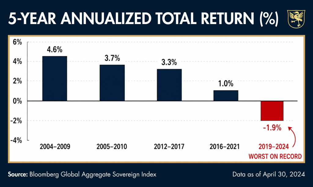
What this simple, and seemingly “boring” chart is telling us boils down to this: Trust in the world’s IOUs is tanking.
This is because that world, at roughly $360 TRILLION in total debt, is effectively one massive “bad credit score.”
As trust in sovereign bonds tanks, the yields on their bonds rise. And as we now know, those rising yields/shark fins are not only scary, they are expensive.
Looking at the IOUs of the big boys—i.e., Germany, the UK, Japan and, of course, the USA- we are seeing more shark fins circling the major global economies as the yields on gilts, bunds, JGBs and USTs rise steadily and dangerously northward.
When Debt Goes from Painful to Fatal
This means the cost of servicing that debt has metastasized from painful to just plain fatal.
When I was a young boy in the Reagan America, for example, total debt in the U.S. was less than $1T.
Fast-forward to today, and the interest expense alone on Uncle Sam’s bar tab is higher than America’s total public debt circa 1980…
Such facts—such truths—are not only scary, they are also criminal.
These “boring” yet now rising yields are dispositive evidence which unmask decades of mismanagement by global central banks, leaders and monetary “experts.”
Legions of “political and economic opportunists” (quoting Hemingway) have dishonestly told the world they could solve a debt crisis with more debt, all of which could then be paid for with currencies created out of thin air.
If such fantasies and policies seemed too good to be true, it was because they were.
Central banks are losing control of their yield curves because the bond market is more powerful (and honest) than their increasingly impotent monetary tools.
Back to the Future
Moving forward, we shall see (and are seeing) what history has always shown: Currencies will be sacrificed to save sovereign bar tabs.
This is bad news for the real world.
As a result of the paper currency destruction needed to monetize drunken debt levels of such historical magnitude, we now see a world awash in the kind of inflationary forces which always devolve into increased economic, military, and social unrest.
Such unrest, of course, is always followed by greater dishonesty, desperation and, of course, debasement signals from mismanaged nations, of which the rising yields discussed herein are screaming proof.
And as warned countless times elsewhere, such debt and desperation also leads to increased centralization from above and less liberties (personal, financial, and political) from below.
Gold’s Honest Reminder
Gold, of course, cannot solve all of the problems now percolating from an undeniable global debt crisis.
But when it comes to dishonest policies and dishonest currencies, gold is infinitely more honest as a store of value in world where paper money systems are robbing you with each passing day.
In fact, honesty and truth are almost as rare today as gold itself. So, who or what will you trust: Physical gold or paper money?

Not a boring chart. It's interesting how much power we attribute to insolvent nations. If they can't really afford to control everyone and everything, and require those that they are trying to control to give them loans in order to continue controlling them, doesn't this break down the illusion somewhat? A total global monetary system collapse is indicative of more than just financial chaos. It is the great cleansing of iniquity and evil that this world needs in order to heal, become productive again, and for people to experience real life and freedom.
The 5-year window is significant beyond the return number because it spans the entire post-COVID monetary experiment. Zero rates followed by the fastest hiking cycle in forty years, all underwritten by unprecedented QE. The chart reads back the aggregate result of that sequence, and the grade is the worst sovereign bond performance in recorded history. Five years of the most interventionist central bank policy ever attempted produced the worst outcome for the one asset class central banks were supposed to protect.
The portfolio consequence is where this gets structural. The 60/40 allocation model that anchored institutional investing for four decades assumed bonds would hedge equity risk. When bonds deliver the worst 5-year returns in history, the "40" becomes a liability compounding the drawdown rather than cushioning it. The correlation flipped from negative to positive, which means the hedging architecture that an entire generation of wealth management was built on stopped functioning. Gold fills the hedge role that bonds just vacated.